
Patagonia CSR Report
Information Design
Research
The research focused on analyzing the volume, tone, and structure of the existing content to understand where readers might feel overwhelmed or disengaged. By closely examining content density, hierarchy, and flow, I studied how information could be broken down, prioritized, and sequenced. This analysis helped identify opportunities to create rhythm within the report and informed decisions around layout, spacing, and typographic emphasis.
Challenges
Organizing a large volume of information without overwhelming the reader.
Establishing a clear hierarchy that guided attention while allowing space for reflection.
Balancing structure and consistency with flexibility across varied content types.
Designing an editorial system that felt deliberate and restrained rather than decorative.
Description
Patagonia’s Corporate Social Responsibility report brings together extensive information around sustainability, ethics, and long-term impact. The challenge of this project lay not in creating new content, but in shaping how complex information could be read, understood, and reflected upon over time. The project was approached as an exercise in information design—treating reading as an experience shaped by structure, hierarchy, and pacing.
Objective
The objective of this project was to design a clear and coherent editorial system that could organize dense CSR content into a readable, engaging, and accessible format. The goal was to support comprehension while respecting the seriousness of the subject matter, allowing readers to move through information with clarity and intention.
Discipline
Information Design / Publishing / Typography
Problem Statement
How might complex corporate responsibility information be structured in a way that supports clarity, readability, and long-form engagement, while remaining faithful to the values and seriousness of the content?
Solution Overview
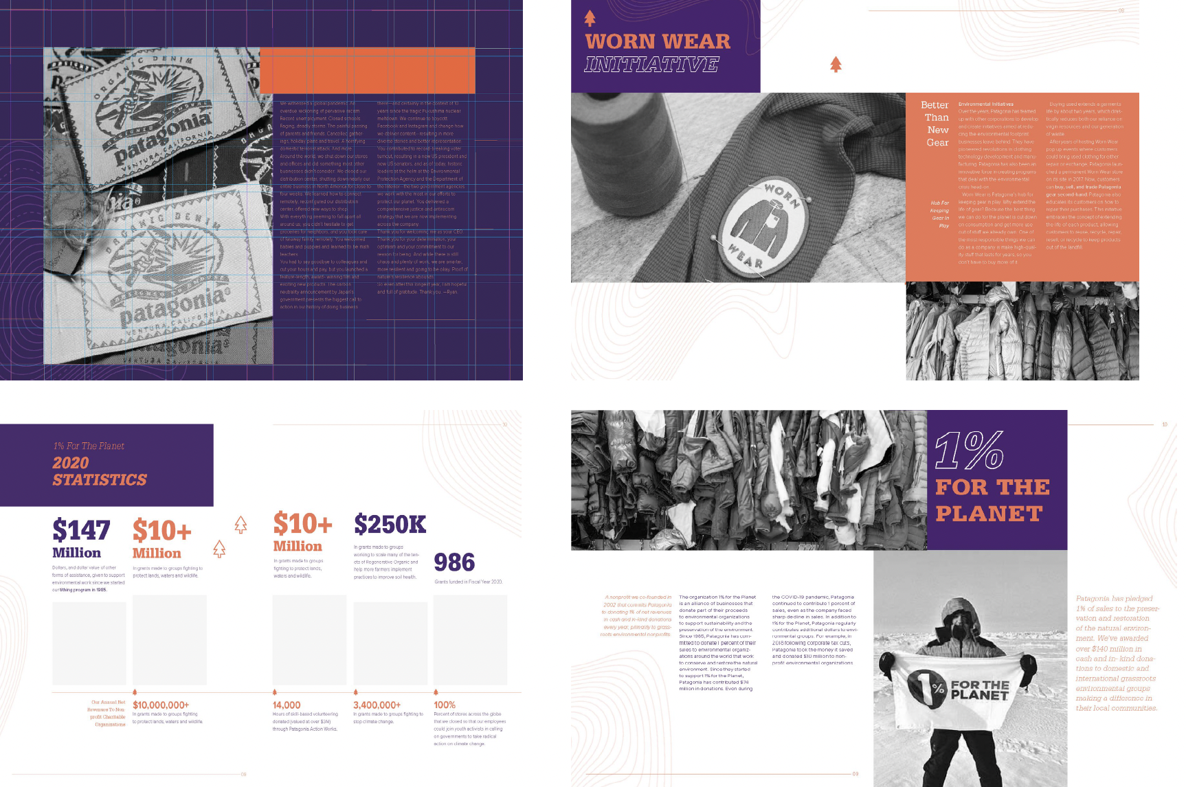
The solution centered on creating a clear and simple editorial system that organised complex content through hierarchy, rhythm, and consistent structure. A flexible grid and typographic system supported both scanning and sustained reading, allowing information to unfold with clarity while respecting the seriousness of the content.
Visual & Information Design Process
The process began with structuring the content through a clear hierarchy that could support both quick scanning and longer reading. I explored different grid systems, layouts, and spacing to understand how information could be paced across pages, allowing dense content to feel more organized and easier to move through.
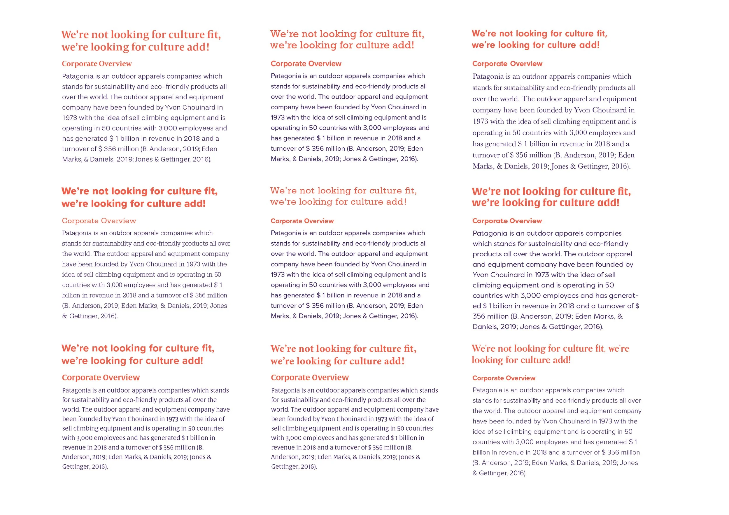
Typography became a key part of shaping this experience. I tested multiple typefaces through layout studies, paying close attention to readability, legibility, spacing, kerning, and line length. These experiments helped me understand how small typographic decisions could affect comfort and clarity over extended reading. Rather than relying on visual decor, the system was shaped through structure and type, resulting in an editorial framework that felt considered, consistent, and clear.
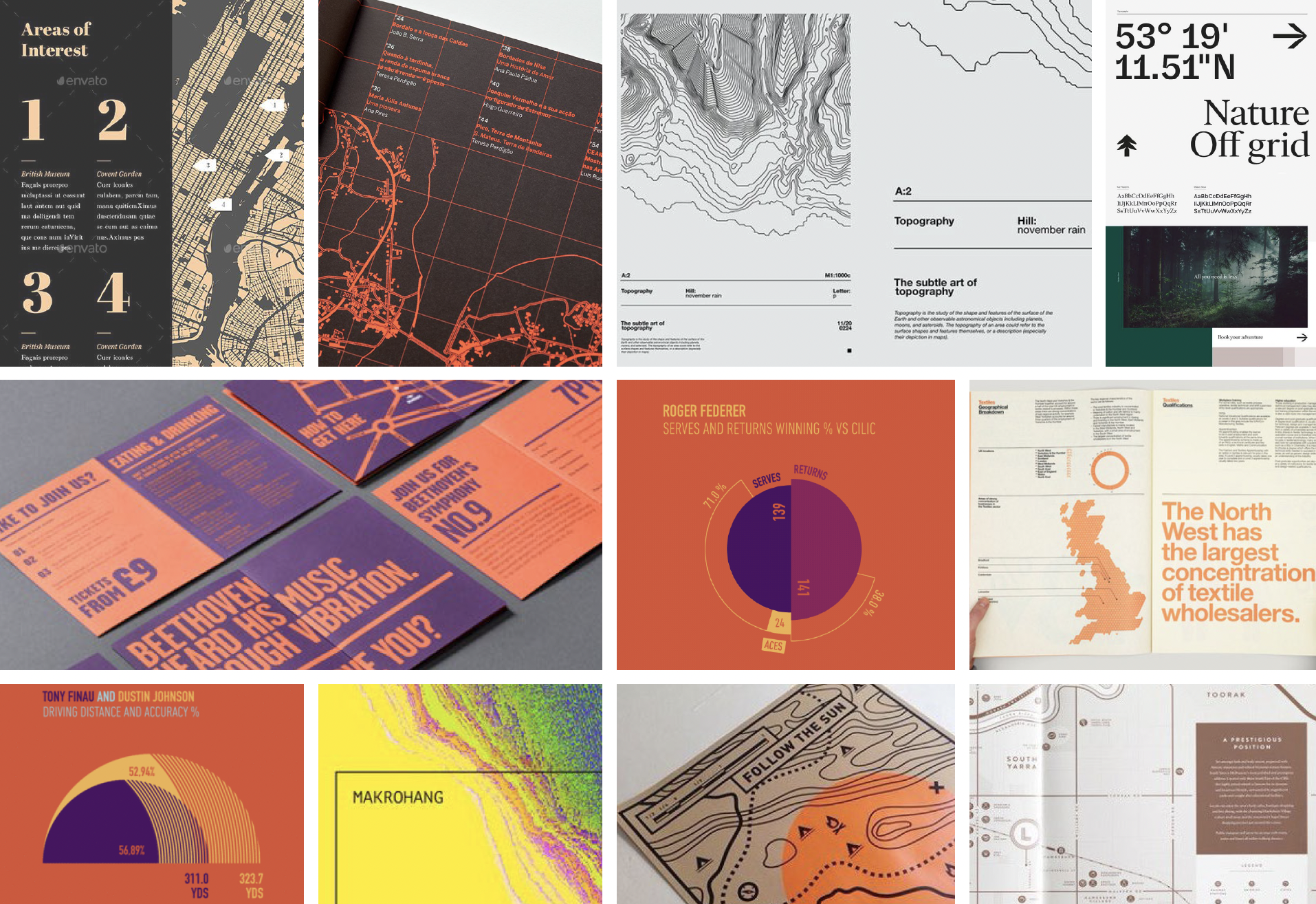
Type Experiments
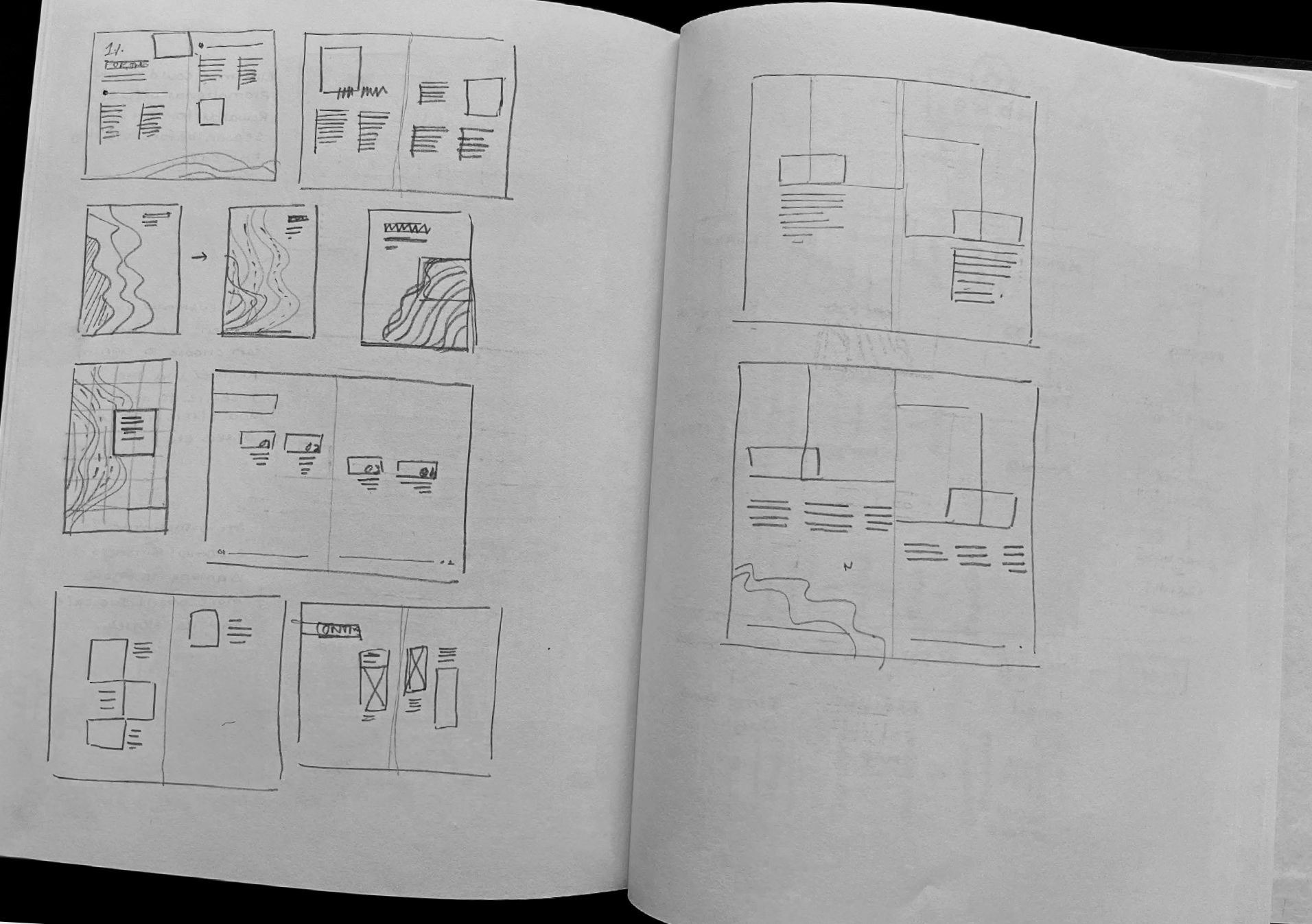
Layout Sketches
Layout Explorations
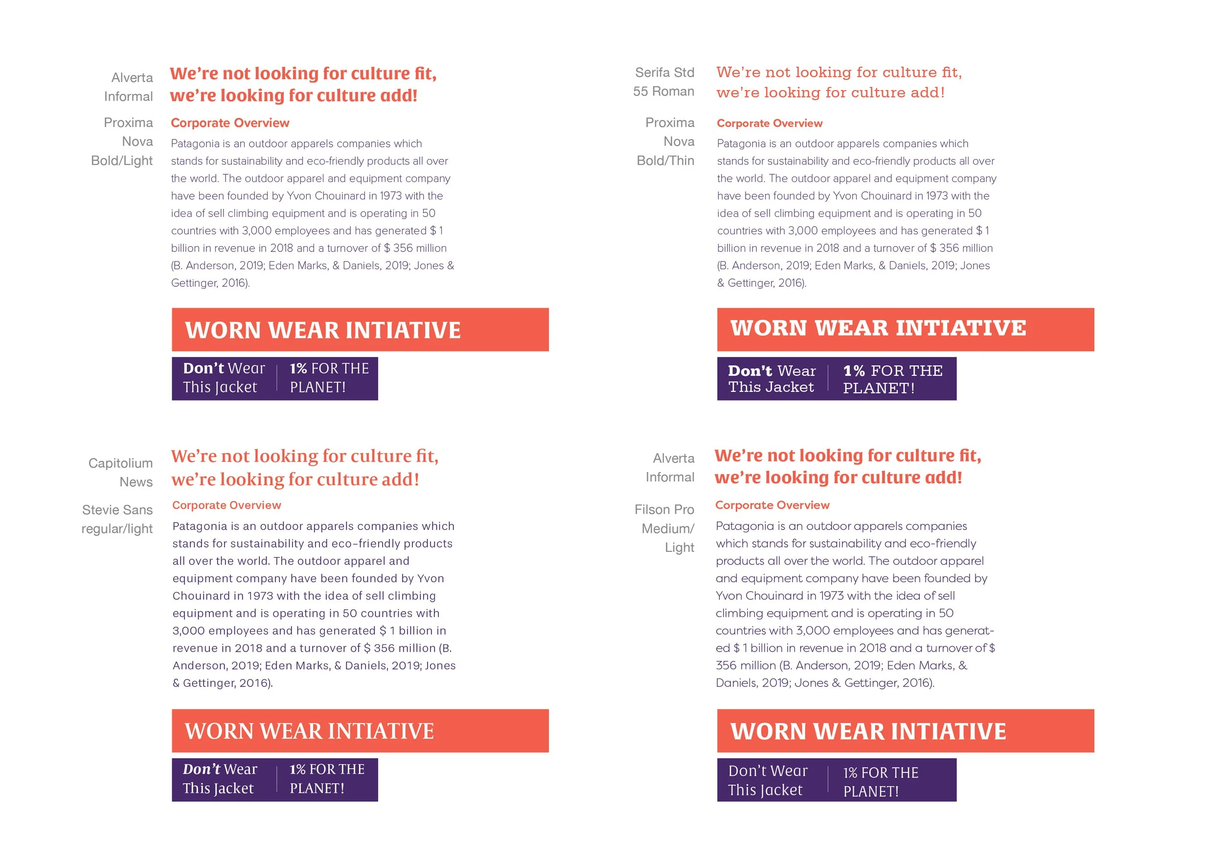
Type Experiments
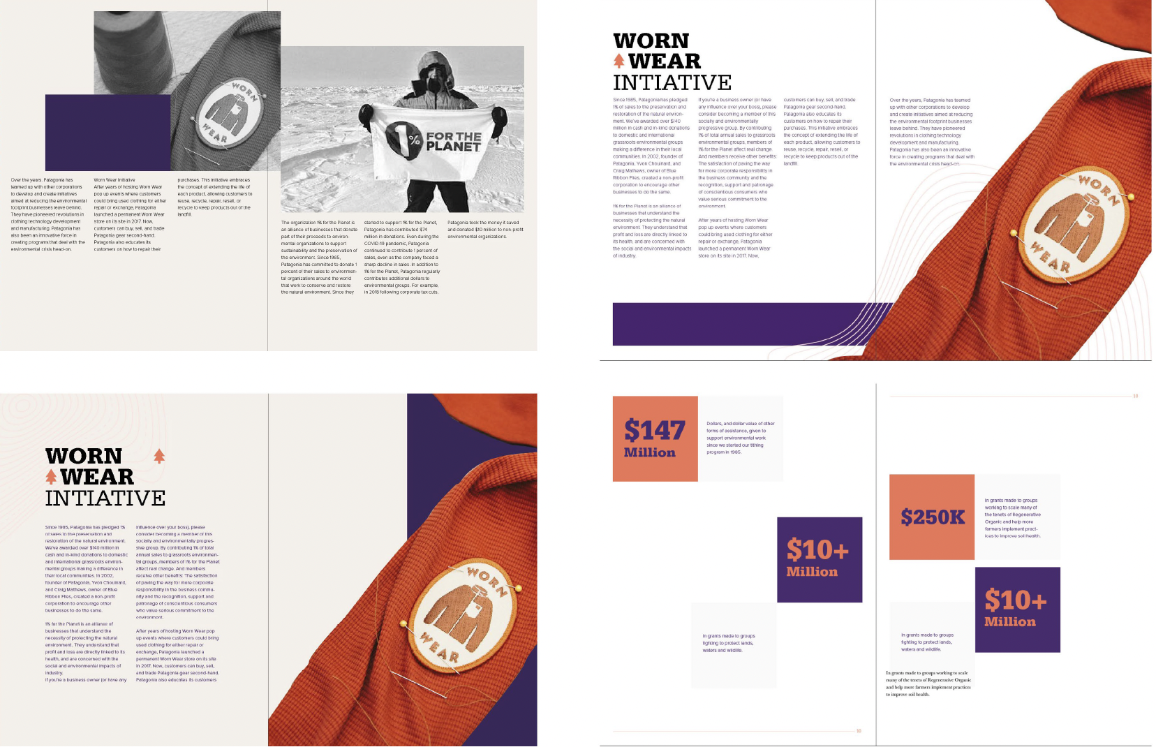
Layout Explorations
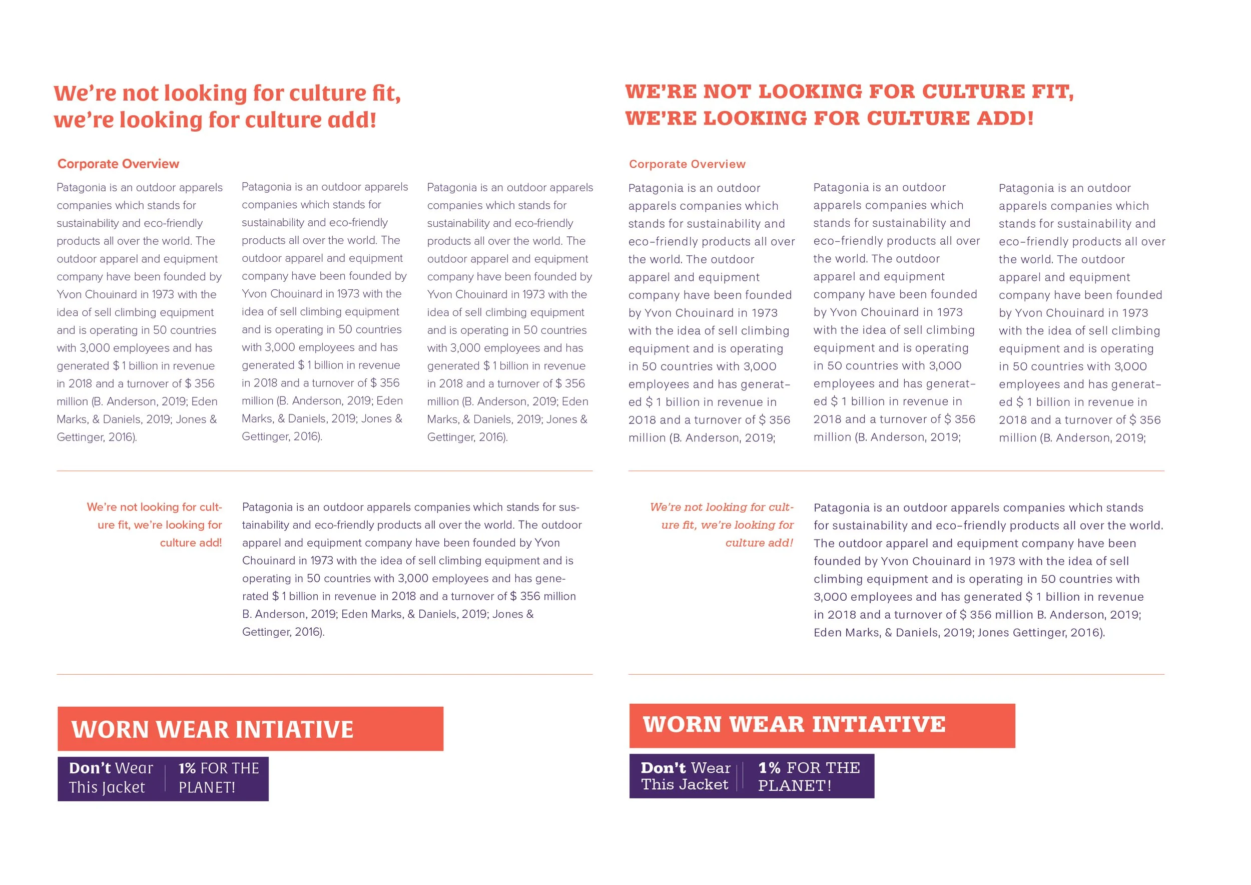
Type Experiments
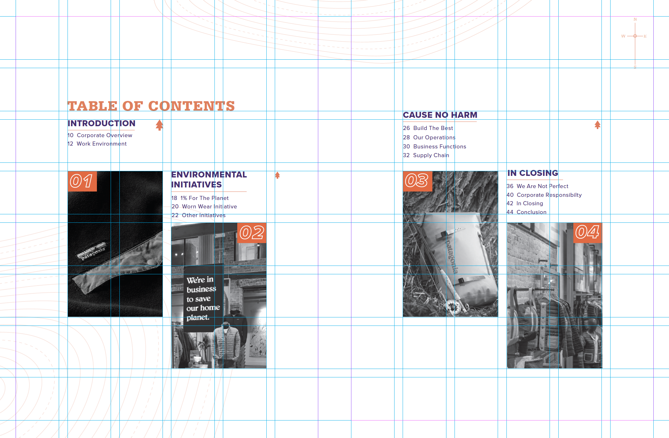
Grid Structure
Grid Structure
Grid Structure
Grid Structure


System Outcome
Developed a cohesive editorial system that brought clarity and order to a dense body of information.
Established a consistent grid and clear hierarchy to support both overview reading and deeper engagement.
Used thoughtful pacing and spacing to allow content to breathe while maintaining continuity across the report.
Enabled readers to move through complex information with confidence and understanding.
Learnings
Gained a deeper understanding of information as an interactive experience shaped by structure and time.
Learned how hierarchy, spacing, and rhythm directly influence comprehension and engagement.
Recognized the value of restraint as a design choice when working with serious, value-driven content.
Reinforced the importance of approaching editorial work as a system rather than a sequence of isolated pages.


