Pawtrero Re-Branding:
A Visual Communication
System
Research
The research began with a close reading of Pawtrero’s existing visual and communication materials, looking for patterns, gaps, and inconsistencies across print and web channels. Observing visual clutter, fragmented messaging, and limited differentiation from competitors revealed what felt unclear, what competed for attention, and where structure was needed. These insights formed the foundation for building a more cohesive visual language and informed decisions around hierarchy, repetition, and clarity across touchpoints.
Challenges
Resolving a lack of hierarchy and consistency across existing materials, where messages competed rather than guided attention.
Creating a unified visual system across posters, printed materials, and the website, each with a different pace of interaction and level of engagement.
Designing for real-world contexts where Pawtrero is encountered briefly, often from a distance or in passing, requiring information to be understood at a glance.
Description
Pawtrero, is a women owned pet store based in San Francisco that specialises on dog and cat needs.
Objective
The objective of this project was to rethink Pawtrero’s visual and communication system to bring clarity, hierarchy, and accessibility across physical and digital touchpoints, while strengthening its identity as a warm, community-focused brand.
Personas
-
Context
Engages with Pawtrero more intentionally—through printed material or the website.Behavior
Spends slightly more time reading and exploring
Looks for consistency and confirmation of trust
Compares Pawtrero with other local services
Needs
Reinforcement of credibility and care
Clear secondary information (services, values, next steps)
A sense of familiarity across touchpoints
Design Implications
Consistent system across formats
Structured layouts that support scanning and deeper reading
Repetition of key visual and informational cues
-
Context
Encounters Pawtrero while moving on the street, from a distance, or in peripheral vision.Behavior
Notices signage briefly, often while walking or multitasking
Makes quick judgments based on clarity and legibility
Does not stop unless information feels immediately relevant
Needs
Clear identification of what Pawtrero offers
Immediate reassurance and legitimacy
Minimal information presented in a logical order
Design Implications
Strong primary message visible at a glance
Clear hierarchy that prioritizes essential information
High legibility and reduced visual noise
Problem Statement
How might Pawtrero communicate essential information clearly and consistently across physical and digital touchpoints, while remaining approachable, local, and community-oriented?Solution
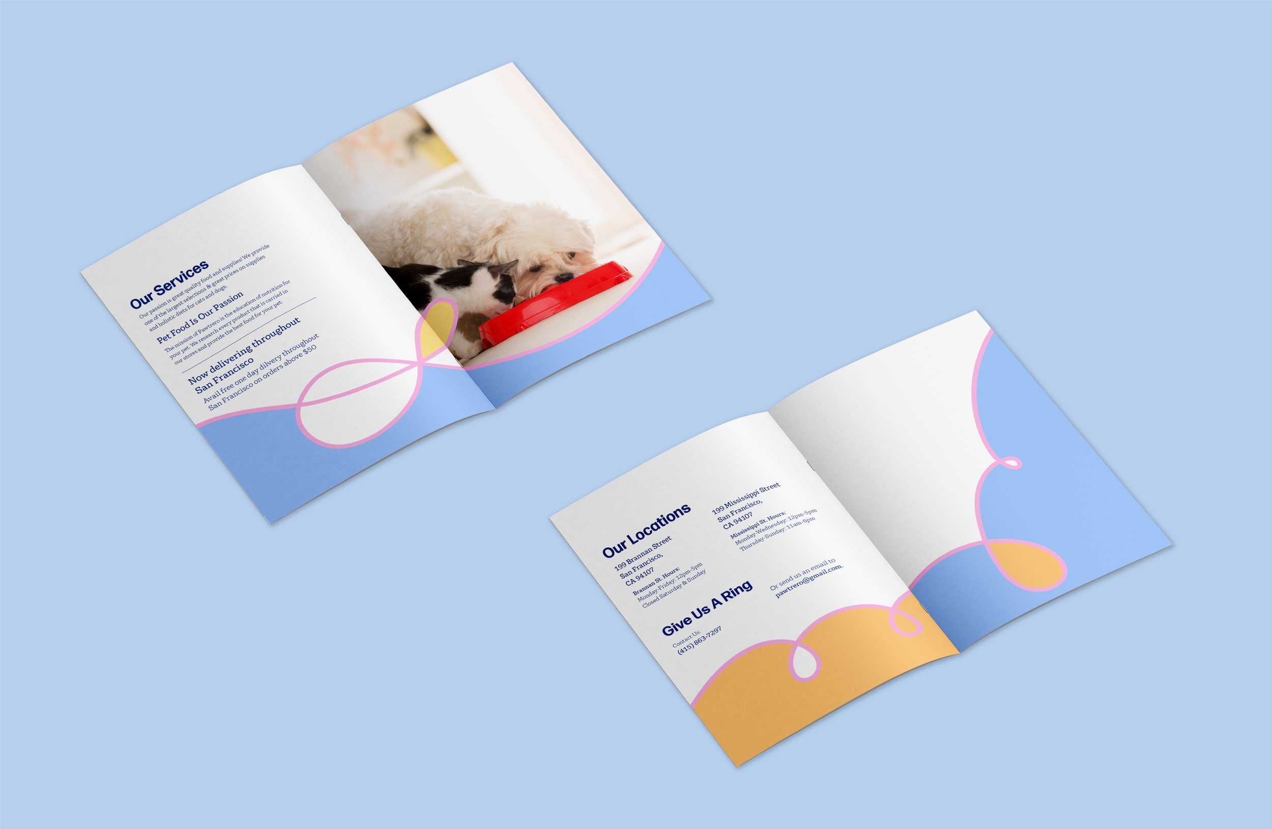
Rather than treating each output independently, I approached Pawtrero as a communication system. I established a clear hierarchy to guide attention, supported by consistent layouts, typographic structure, and spacing rules. This system was designed to adapt across posters, printed materials, and the website, allowing each touchpoint to function on its own while remaining part of a larger, unified whole.
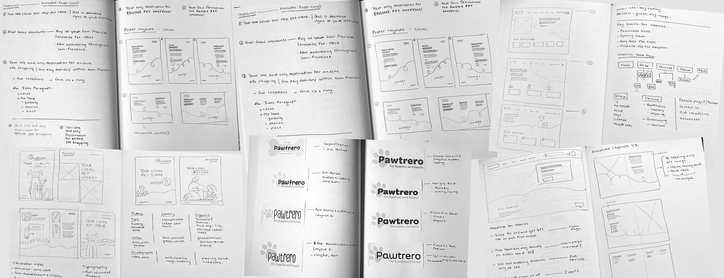
Visual Process
The visual process focused on establishing structure before form. Early exploration centered on defining communication priorities and testing how information could be organised to guide attention naturally. Sketches and layout explorations were used to study hierarchy, spacing, and flow before refining visual elements.
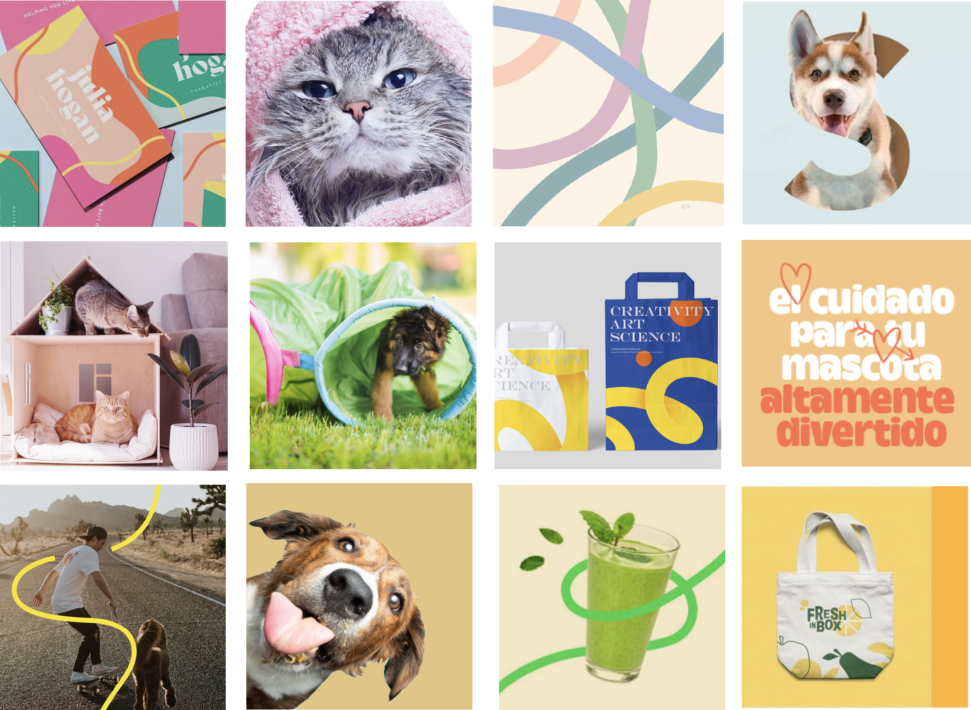
Moodboards and references supported decisions around tone and cohesion, while grid systems and typographic structure helped create consistency across formats. Rather than designing isolated artifacts, each visual decision was considered in relation to the larger system and how it would repeat, adapt, and scale across touchpoints.
Visual Style Guide Overview
Brand Fonts
Headline Font: Forma DJR Micro
Bodycopy: Gelo Light and Regular
Visual elements/Illustrations:
Free-flowing lines
Imagery
Playful, compassionate, lighthearted
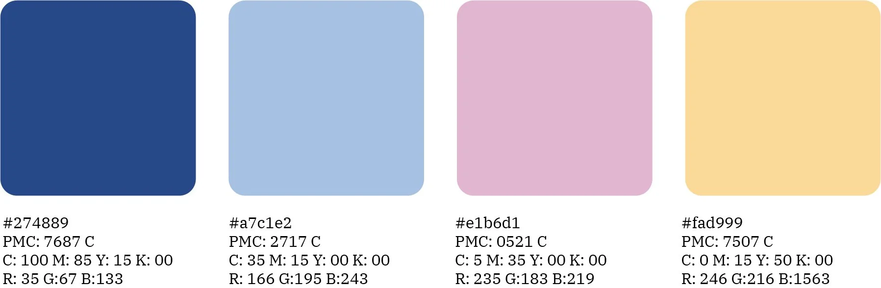
Colors


Outcome
Developed a cohesive and adaptable communication system that improved clarity and recognition across physical and digital touchpoints.
Established a clear information hierarchy supported by consistent layouts, typographic structure, and spacing rules.
Enabled each touchpoint to function independently while remaining part of a unified system.
Created a flexible framework capable of supporting future growth and evolving communication needs.
Learnings
The importance of listening and observing before designing, especially in real-world, context-driven environments.
How hierarchy and structure directly shape understanding and user behavior.
That interaction design extends beyond screens and exists through space, repetition, and context.
The value of designing systems rather than isolated artifacts, leading to more resilient and meaningful outcomes.